How Do I Compare Date Ranges on a Report?
In this article, we look at how you can use Comparison Ranges and Time Series Metrics to compare different date ranges on a report and track the changes between them.

Video more your thing? Check out the video version of this guide here.
So how do we go about setting this up?
What is a Comparison Range?
A comparison range is where you have 2 (or more) date ranges on a chart report so you can compare the results between different periods.
This has a number of great use-cases, particularly when it comes to trend analysis and trying to assess your relative performance over a period of time.
Here's an example on one of our built-in reports, the Last 30 Days Comparison (under Sales Over Time):
Comparison Ranges work on any of our chart reports (think anything with a graph and/or totals at the top). So as you can imagine, there are a lot of possible use-cases.
Let's take a look at how to set this up.
Adding a Comparison Range
First and foremost, let's look at how to add another date range to a report that doesn't have one yet.
For example, we can start with Last 30 Day Sales Summary
Start off by setting your initial date range at the top. You want this to be the oldest dates in the range that you are comparing

This is because you want the date ranges to run in chronological order, so that the percentage increases/decreases over time are displayed as time moves forward.
So here we'll put Last Month and choose a Daily breakdown so we can see how each day compares in terms of Sales performance.

You must put a breakdown in for this to work (e.g. Daily, Weekly, Monthly, etc), so switch it from Summary to whichever one you need.
Next, go to the top right corner, click the More... menu button, and click Add Range:
Here a dialogue box will pop up that lets you choose a second date range to add to the report.
We have a lot of options here, but for now we're going to type in 'Current Month'.
Click Ok and now we'll see a great Daily comparison for how we've done each day this month compared to the one before.
Remember - if one of your date ranges isn't complete (e.g. Current Month when we haven't reached the end of the month yet) then you should expect 0's for those applicable periods.
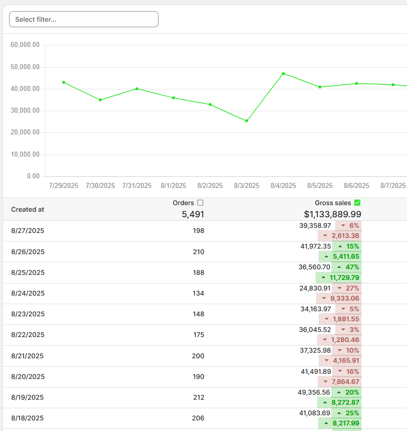
Notice that now, we have 2 rows for each Month and 2 types of line on the report.
In our chart, the solid line is our original date range (Last Month, i.e. July) and the dotted line is our new comparison range (Current Month, i.e. August) that we added.
Note - in this case the report is comparing the Gross Sales (green checkbox at the top).
You can of course check/uncheck any of the checkboxes on the column headers to add/remove them as lines on the graph.
What is a Time Series Comparison Metric
The other way we can do a comparison in Report Toaster is as a Time Series via a Metric.
A metric is any field in Report Toaster that works with totals at the top, like a Sum or Average.
E.g. Gross Sales on the 30 Day Summary report.

We can create Custom Metrics too - see our Calculated Fields article for more information.
A Metric on a Time Series (think a chart report with a breakdown like Daily, Weekly, Monthly etc) can also then have a comparison added in the table like so:
Adding Time Series Comparison Metrics
Again, we'll start off with the Last 30 Day Sales Summary.
Click the Columns button (top right) to adjust the columns that appear on the report:
Next we can click the comparison (+/-) button on any metric field we want to compare.
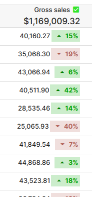
So for example, if we're looking to compare our Gross Sales each day and how they have increased/decreased, lets click the +/- button next to that.
This will pop up with a small window, with a couple of options to cover.
You can then include/exclude any of the following via the check-marks:
- The metric's value (e.g. $100,00 in Gross Sales). You probably don't want to remove this unless you ONLY want to see the increase/decrease.
- What percent the metric increased/decreased from the prior row (e.g. +5%).
- How much the metric increased/decreased from the prior row (e.g. +$4,500).
Click Ok when you're done (I selected all of them here) and then your column in question will look like this:
This sort of information is vital for trend analysis, and can save valuable time and effort in comparing data over a specified range.
So that's really all there is to it!
If you need any further help with creating a comparison range or configuring your report, feel free to reach out to us at any time.
Related Articles
How Do I Adjust the Date Range on a Report?
Another entry in our 'Basics' series, this article will look at Video more your thing? Check out the video version of this guide here. - How to change the dates/times on a report and - How to adjust the breakdown of the displayed data (summary vs. ...Premium Report - First Time vs Returning Sales
First Time vs Returning Sales First Time vs Returning Sales is used to compare orders within a select period and divide Sales numbers into First Time vs. Returning Customers for each. Unlike First Time vs Returning Customers, the date range for this ...Whats New? - January 2023
It's the start of a new year, and we wanted to kick things off with something exciting - comparison ranges in Report Toaster! Some of you might be familiar with this feature in Shopify that lets you compare reports with a prior period? Well, now we ...How Do I Change Profile Settings (Time Zone & Regional Formats)
Another quick addition to our basics series, this article covers how to adjust your profile settings in Report Toaster. Video more your thing? Check out the video version of this guide here. For instance, let's say I want to switch - Time zone (from ...Comparison Ranges (Shorts)
Learn the basics of how to setup comparison ranges on a report in <5 minutes! (Be sure to switch to Full Screen and high resolution for best results. Refresh your browser if the above embedded video doesn't display, or view directly here.) In this ...